

In case you are just starting your way as an entrepreneur or business owner, you may not know much about branding and its importance. Besides, if you have never worked closely with branding design, you may not be familiar with negative space.
More experienced brand managers and designers know for sure that negative space can be used creatively to form compelling visuals that have a dual or hidden meaning.
Let us focus on what negative space is and how you can apply it to benefit your brand. Besides, we will dwell on the best examples of negative space applications for branding of world-famous companies.
Table of Contents
What is negative space in design
Before any further arguments, it is necessary to get a clear understanding of what negative space is.
The most straightforward and precise definition of negative space is a blank space between elements. Negative space is nothing on its own, but you can only get foreground if there is a background.
This creative hint may be easily and, what is more critical, beneficially applied to numerous branding elements. Furthermore, you might not even recognize it immediately. Thus, email signature software automatically creates negative space to separate text, make it less crowded and more pleasing to the eye.
What design elements look great with negative design space
Imagine yourself coming into the room packed with various things. You could hardly concentrate on one specific object. The situation is pretty much the same when a user or a customer sees an element that lacks a vital air of negative space.
Now you understand the value of negative space and how it works generally. Let’s make it clear what design element of your company branding could benefit from negative space.
Logo
The logo is the most widely spread and well-recognized element of your branding. People will always associate your company, product, or services with the logo.
Creative application of the negative space in logo design is a key to a complex message via simple lines. It can be achieved by creating recognizable forms and elements using both positive and negative areas. You can let online logo generating tools do the work for you so you get the perfect design without having to worry about the rest.
Typography
Another vital element for the application of the negative space creative approach is typography. Good typography is not only about beautiful forms of the letters but spaces between them as well.
The text needs space to breathe. Increased lien spacing makes the element comprehensible and legible for a better user experience. Thus, proper spacing is vital whenever the text of the message spills onto multiple lines.
Email signature
An email signature is another branding element that helps to express your brand identity. This email part tends to anchor the attention. Therefore it requires a particular design approach.
You can make good use of negative spacing to emphasize the essence. The application of a simple email signature generator to draw signature and good spacing will make the human eye naturally gravitate in the direction you want. 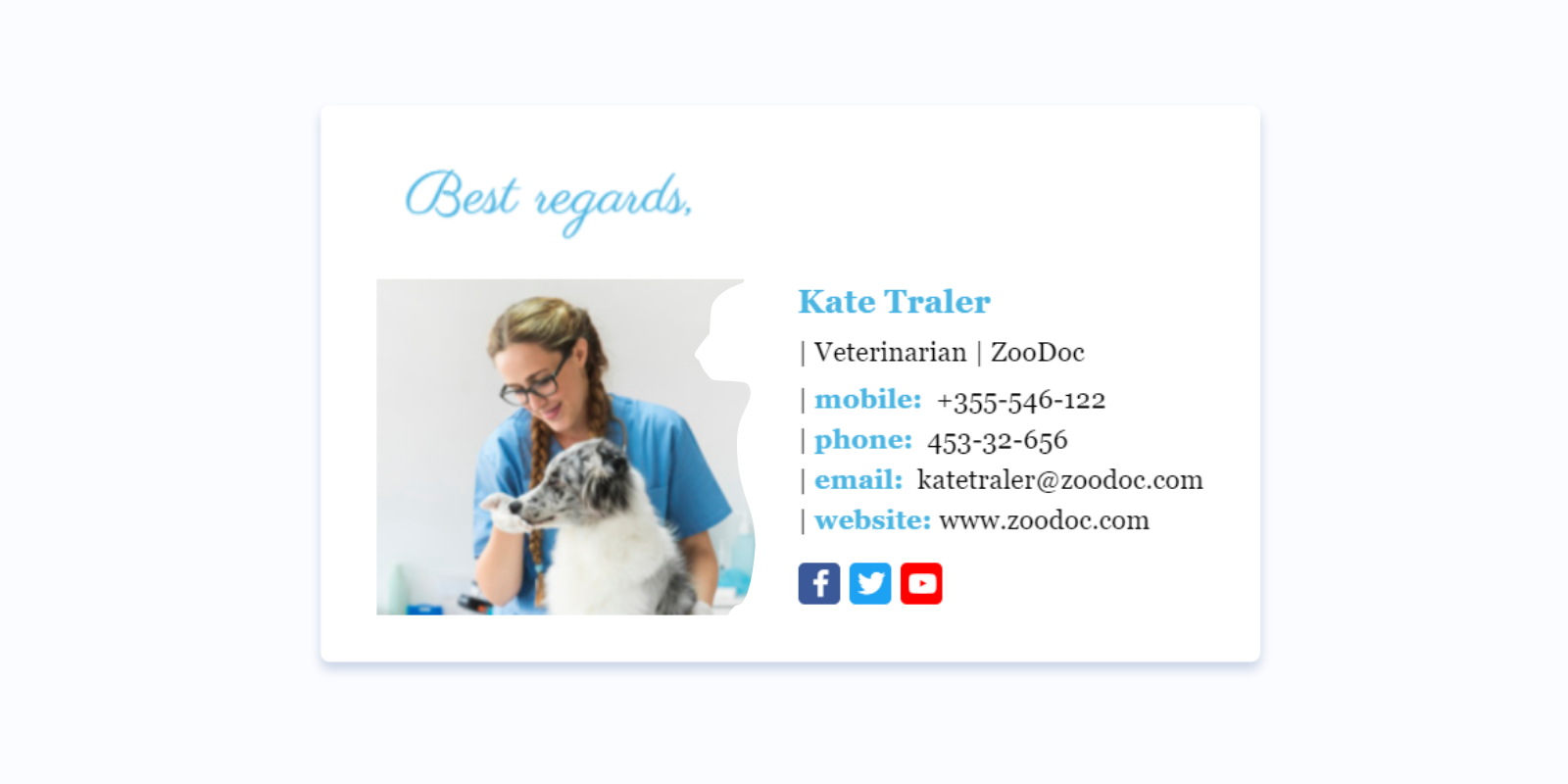
7 best examples of using negative space in branding
Here we come to the practical illustration of the effect of innovative negative space application. This is the list of the 7 best examples of negative space use in branding.
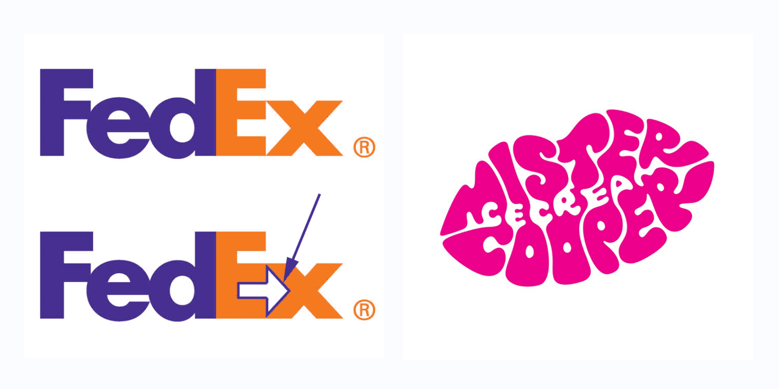
FedEx
This well-known brand managed to achieve the incredible effect by pushing letters closer in their logo. What is to do with negative space?
Have you ever noticed an arrow formed by the negative space between the letters ‘E’ and ‘x’? Undoubtedly you see it now. The combination of simple letters develops a new meaning to colors and negative space.
Mister Cooper
Another brilliant example of a company that placed a bet on negative space in their logo and achieved success is Mister Cooper. This ice cream brand is famous for its letter mark logo in the shape of sexy rose lips.
The main trick is that the negative space between a brand name’s words makes the product name ‘ice cream.’ Delicious enough, right? .’
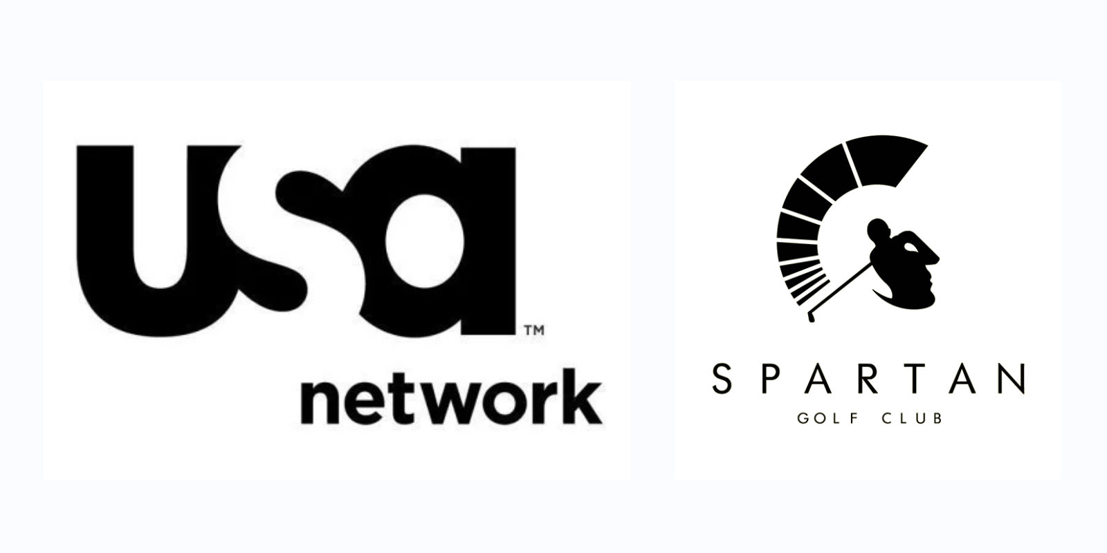
USA Network
The company made its logo a representation of strong connections with its audience. Squeezing its letters and applying negative space in ‘s’ helped the designers put the correct emphasis on the company values.
Just a few letters reflect the strength and solidity of the brand.
Spartan Golf club
The logo of the Spartan Golf Club reveals an immense power of symbols. In this case, the Spartan warrior’s helmet is indicated by an arc which is made by the swing of the golfer, which is again a smart application of negative space.
Furthermore, get a closer look and recognize the face of a Spartan in the logo.
Pittsburgh Zoo
Believe it or not but the logo of a Pittsburg Zoo has a few hidden elements as well. First of all, you can see a tree with two birds flying above.
However, after more careful examination, you can also spot a gorilla and a lion staring at each other while two fish are jumping out of the water at the bottom of the tree. This logo is a piece of art in respect of negative space application.
Ed`s Electric
The logo of Ed`s Electric is so smart and natural for visual perception. Consisting of the two most recognizable electric devices’ symbols also hides the letter E in the negative space because it relies on positive space.
This logo perfectly fits the description and portrays the brand as an electrical company.
WWF
This one is the most adorable example of the accurate negative space application in logo design. This logo uses negative space to create the form of the panda’s head and back.
The designers` goal had been to create a symbol that would overcome language barriers and be recognizable to all people. Undoubtedly, It was successfully achieved.

Conclusion
Negative space is a vital part of many branding elements. Not all designers and brands understand and practically apply it in their branding. But those who are successful in its use communicate much more with fewer efforts.
Important details pop up and get a new life when the negative space is used accurately. Thus, negative space design becomes a viable way to convey and demonstrate other essential information to audiences.