
Data visualization is a form of modern visual communication that can be a solution to present data to make it easier to understand. In terms of language, it can be interpreted as a visual display in the form of graphics of certain information or data. In short, data visualization converts a data set into something simpler to present. In other words, the goal is to communicate information more efficiently using information charts, so that readers can more easily understand patterns, outliers, and trends in data.
According to Wyzowl, as many as 8 out of 10 people (or 80%) have stated that it is easier to understand something visually. In the business world, of course, the visual analysis will greatly help business development.
Why? Because a company’s decision-making should be based on the data obtained. In order to make the data easier to understand and make the right decisions faster, data visualization is needed.
Visually displayed data allows for faster data understanding. Previously, flashing back to the old way of looking for core data from long sentences was certainly not an easy thing. However, presentation in the form of charts and graphs can shorten the search time and understanding of data.
Table of Contents
Visualization is everything
Several research results obtained the fact that humans can remember 80% of what they see and only remember 20% of what they read. The human brain is easier to remember pictures faster than the arrangement of words. Therefore, data in visual form makes it easier to digest important data and information.
Data visualization summarizes important information in a simpler view. Data about the company’s work based on certain variables becomes easier to read. This certainly facilitates communication between stakeholders as decision-makers. On the other hand, presenting raw data in written form is not recommended. Especially with the long sentences that take quite a while to read and understand the meaning.
Data visualization makes it easier to understand the data owned by the company so that new policy-making is easier and on target. In more detail, the following are the conveniences obtained from visualizing data:
– Makes it easy to understand trends and stories from data.
– Shorten data understanding time.
– Facilitate data analysis.
– Makes it easier to communicate data more effectively.
– Supporting business development according to the times that have now entered the digital era at a rapid pace of development.
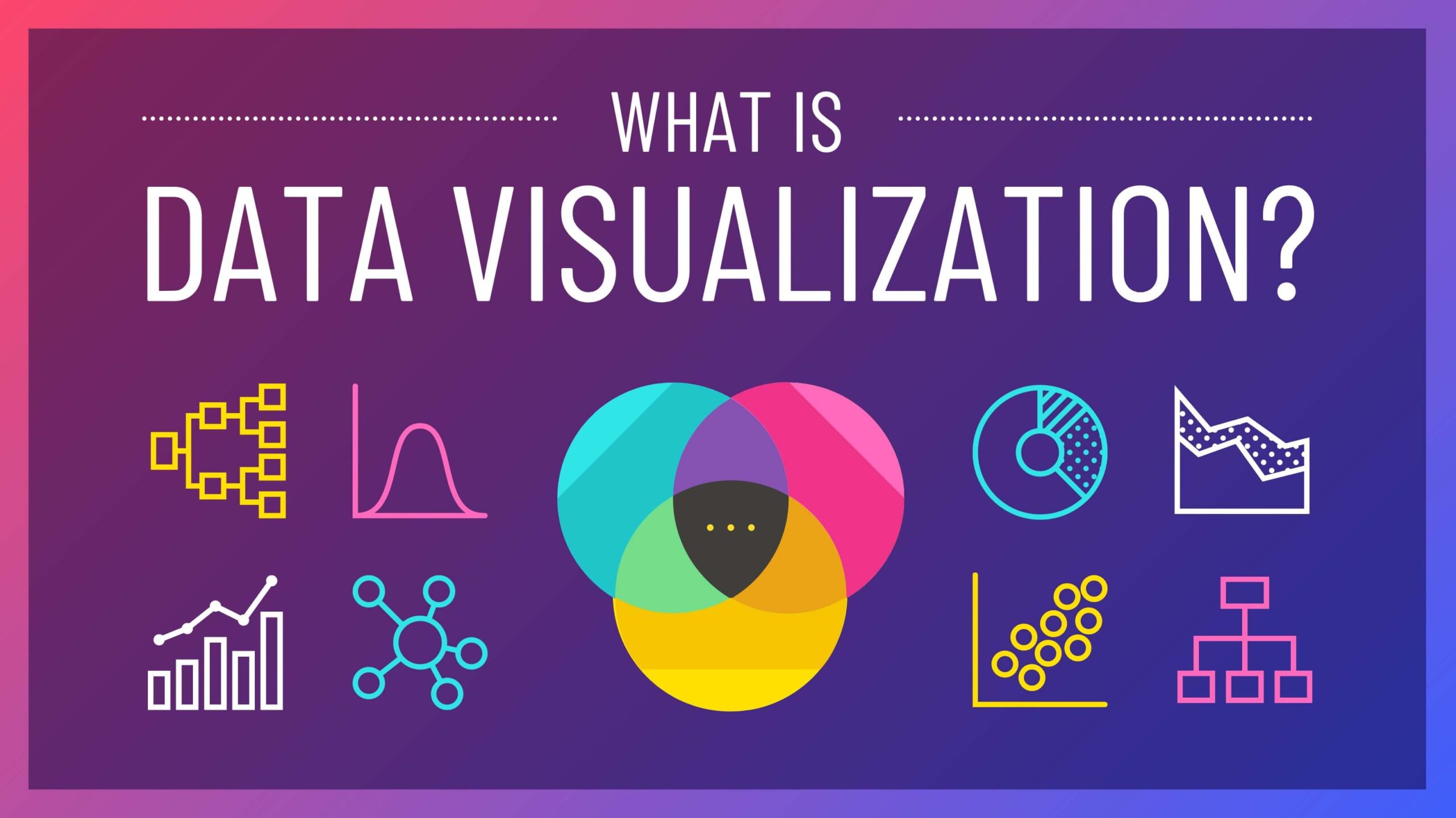
Types of Data Visualization
The needs of each company in the delivery of data can be different. Therefore, the required visualization will be different. In this case, there are several types of data visualization based on the objectives and variables needed, including:
- Temporal Type Visualization
This type is the type most often used in a company or business person. This type is relied on to present one-dimensional or linear data series and is among the easiest to learn.
- Hierarchical Type Visualization
The next type is the hierarchical type. This type is usually used to show the existence of a relationship or relationship between one thing and another that is more dominant.
- Network Type Visualization
The use of this type of data visualization is quite common in a company. For example, the form of a network that is often used is the node-link diagram or word cloud.
- Multidimensional Type Visualization
This type is the primary option for visualizing data consisting of multiple dimensions or variables. Because it consists of many data sets, this data will look more striking and attractive in the form of visualization.
Did you find this post helpful?